


'I'M A WORM': A musical approach to poster design

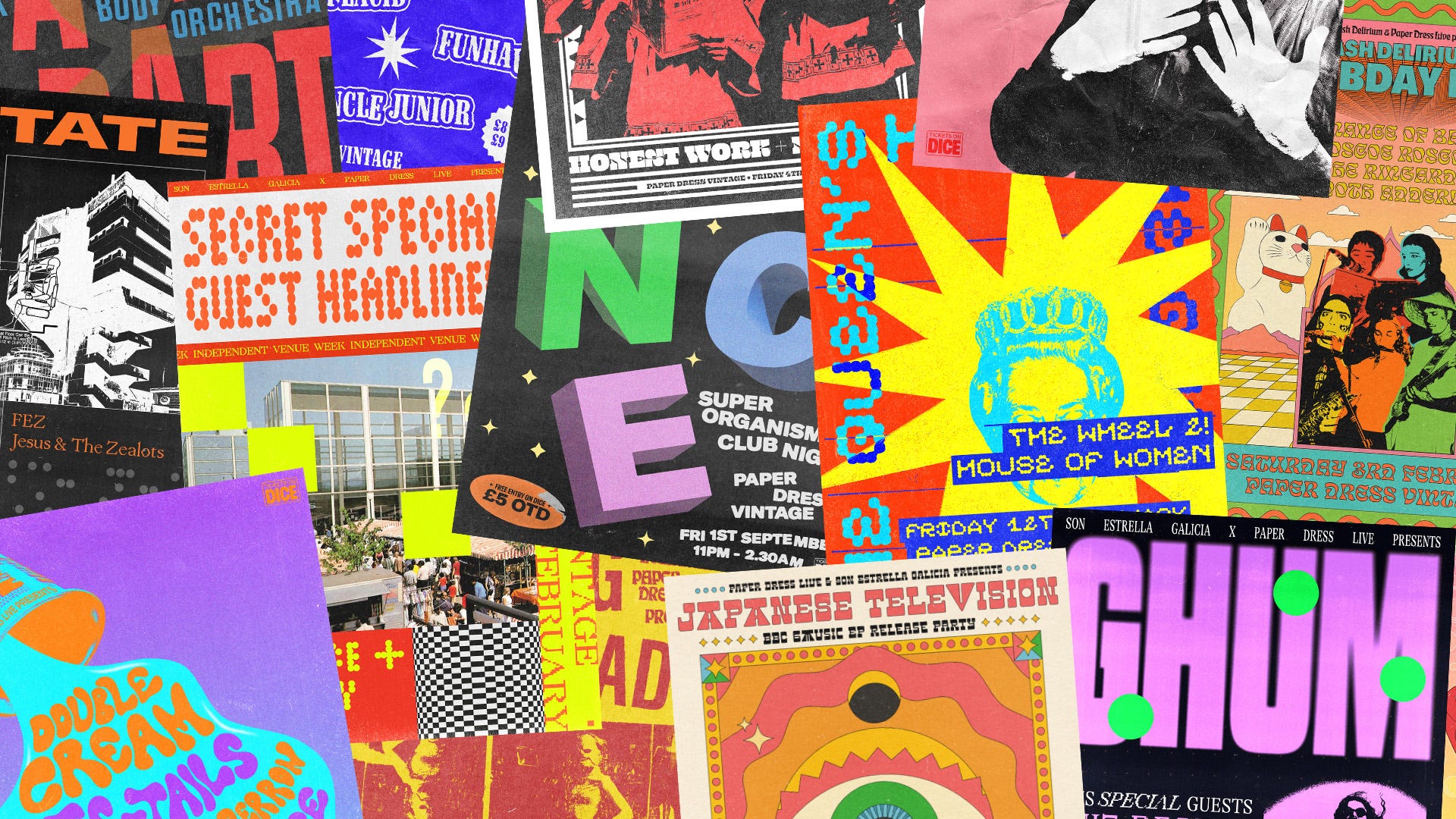
Early last year, Pierre, my good friend and venue booker for Paper Dress Vintage, asked me to make a poster for a new artist called Jim E. Brown. His songs were called things like ‘I’M A WORM,’ ‘SALAD CREAM BUTTY,’ and ‘I FUCKING HATE YOU (YOU RUINED MY LIFE).’ Based on these song titles alone, I was intrigued. I decided to do a take on the 1960s Avalon Ballroom posters, with Jim E. Brown’s slightly forlorn-looking face as the focal point. I hadn’t done too many posters before, but I found I enjoyed the process. Little did I know this would be the start of a long and fruitful relationship.
Paper Dress Vintage is one of my favourite venues in Hackney (and by extension London, because I don’t like to leave Hackney). I’ve played several times, and there’s even a photo of me on the website gallery. Vintage clothes shop by day, gig venue by night, and it’s in the perfect location, just opposite Hackney Central Station. I’ve never officially been given the title of ‘poster designer’ for Paper Dress Vintage, but 40 or so posters down the line, I think it’s safe to say I’m their go-to guy.
“The abundance of gig posters can quickly become confusing and overwhelming, and the impact of each poster as a unique piece of art can easily get lost.”
Hackney is home to some of London’s best music venues; Moth Club, Shacklewell Arms and EartH to name a few. As a result, hundreds of gig posters are produced every week, lining the walls of countless bars and local businesses, as well as social media feeds. The abundance of gig posters can quickly become confusing and overwhelming, and the impact of each poster as a unique piece of art can easily get lost. There are, however, some standout poster designers in London doing things a bit differently. Adélaïde de Alfaro brings a fine art approach to her posters, resulting in some strange and surrealist designs. Similarly, Berlin-based designer Olya Dyer has become synonymous with live music in Hackney due to her work with Bad Vibrations, who organise some of East London’s best live events. Her dark and illustrative style is reminiscent of 1950s French New Wave design. If I was going to be producing posters for Paper Dress for a while, I knew I wanted to do something that would stand out from the crowd.
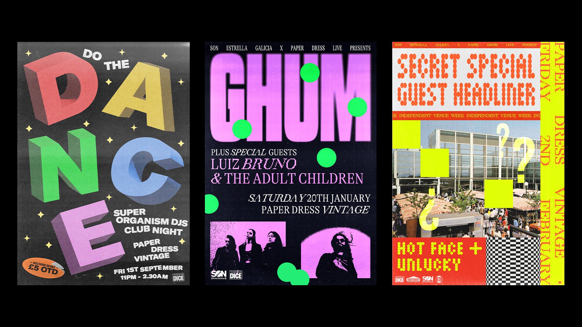
Some poster designers have their own clear, unique and authorial style, and by commissioning them you pretty much know what to expect. For example, if you commission Bráulio Amado for a poster, you probably know the sort of thing you’re going to get (by which I mean, you have absolutely no idea what you’re going to get). I don’t see myself as that type of designer, especially not when it comes to posters. I want the viewer to be able to understand what music they can expect to hear before they buy tickets. Due to the slightly eclectic line-ups commonplace at Paper Dress, this means that I often use a variety of styles and techniques depending on what I feel couples best with the music.
“Whenever I have produced music in the past, be it with Yuck, my solo music, or other bands I’ve produced, it’s usually always put through a filter of grit and distortion. I would say I take a similar approach to design.”
Coming from a music background, I approach poster design in a similar way to writing a song. First, I need inspiration. This can come from anything; a press photo, an EP cover, the band’s social media feed, but more often than not, it will come from the music. I will always have the band’s music playing in the background while I’m designing their poster. At the same time, I may be flicking through my collection of books and magazines, photos on my phone, or pages in my sketchbook, to see if anything strikes a chord. I think it’s really important for designers to always be creating and documenting, even if it’s just a case of taking iPhone photos of interesting typography or textures you see while you’re out and about (London is great for that). That way, you have a treasure trove of images and inspiration to draw upon when you need it.
Once I have a vague sense of direction in my head, I’ll start putting pencil to paper. Usually, I’ll draw a grid of four rectangles and start playing around with various shapes and letters. This allows me to quickly and easily put ideas into practice without committing to anything. Generally speaking, I prefer designing around a vague sense of a grid to achieve symmetry and balance in the composition. The grid serves as a similar comfort blanket to a classic pop song structure: intro, verse, chorus, verse, chorus, bridge, double chorus. Of course, it should be altered and changed when the mood is right, but it’s a familiar safety net to fall back into. Am I still talking about designing posters? I’m not sure.
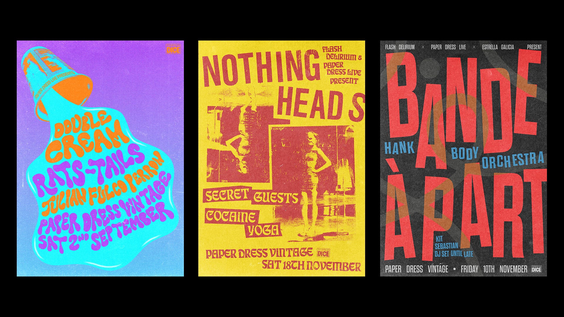
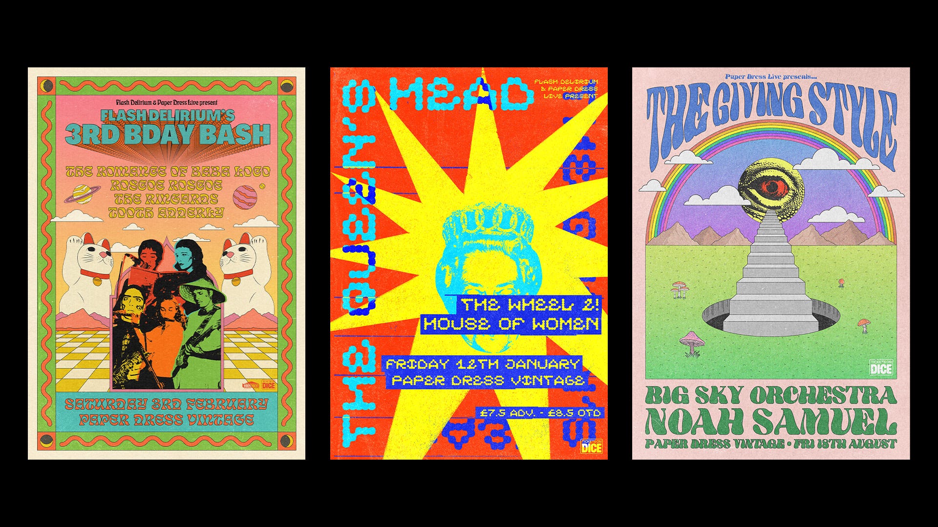
The next step depends on the particular poster I’m making. It might involve photography, painting, collage, illustration, or just big, expressive typography - whatever I feel suits the tone of the bands playing that evening. Whereas many designers like to stick to one style, I often find myself getting bored very easily. I need to constantly keep changing things up to keep myself amused. Once I have a composition I’m happy with, I will always try to degrade it with worn ink effects, displacement maps and textures. This final step can be compared to my approach to music production. I personally never enjoy listening to music that sounds too clean and clinical. Whenever I have produced music in the past, be it with Yuck, my solo music, or other bands I’ve produced, it’s usually always put through a filter of grit and distortion. I would say I take a similar approach to design.
“Much like writing music, the first idea is very often the best.”
As a general rule, I’ll always try to avoid using press photos of the band. That’s not to say I won’t manipulate the press photo to become a part of the composition itself, but I will never use it as the focal point. The gig poster should be a unique piece of art, one that reflects your work as a designer and the band or artist you’re designing for. A band’s press photo will be used ad nauseam until meaningless. (I also have a general problem with band press photos nowadays, a lot of the time they’re slightly cringemaking and pretentious, and I say this as someone who has been in bands with a long history of cringemaking and pretentious press shots. But maybe that’s the start of another piece.)
One major factor that dictates the way I make posters is the fact that I’m often given very little time to design them. Often the maximum time I’ll be given is a week, and taking into account other work, in real terms that often means I can dedicate about three hours to a poster, give or take. However, this time restriction plays to my advantage. I’m an inherently impatient person. I hate reading instructions, and I hate looking for things. The fact that most of my projects are strictly time-bound means that I can’t spend too much time ideating or perfecting, and I’m forced to design quickly and instinctively. Much like writing music, the first idea is very often the best.
2023 was definitely the year of the poster. Looking back over everything I designed over the year I can see how far I’ve come in terms of my own ideas and experimentation. This year, I hope to design many more posters, and push the boundaries of the medium even further outside my comfort zone. Most of all, I hope my posters have contributed something to the zeitgeist of Hackney gig posters, and caused someone to stop in their tracks, turn their head and think: ‘Wow, cool poster. Probably won’t go to the gig though.’